 KitCut
Delete the style from your system prompt
For two days every KitCut film came out looking like a children's cartoon: a business documentary, a hospital explainer, the evacuation of Chernobyl's town. Nobody asked for it. Our own system prompt did, in a paragraph about "charm". This is how we found it, what we deleted, and how we checked the change before shipping it.
KitCut turns a sentence into a finished animated film: Claude writes the script, draws or paints every scene in code, narrates it and scores it. Every film starts from the same set of instructions, the studio's system prompt. Whatever that prompt says, every film hears, whatever it is about.
The film that gave it away
On September 27 someone asked for an 8-minute hand-drawn documentary: Dell went private, HP split in two, and the AI data-center boom decided which bet was right. Written for investors and business readers. Here is what came back.
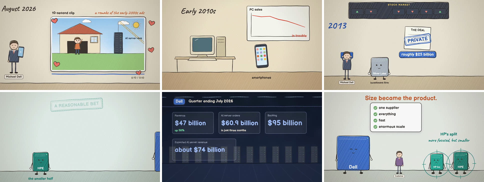
The numbers were right and the research was good. But the servers had faces, the frame was trimmed with hearts, and the companies were drawn as cheerful mascots. For a story about a $25 billion buyout, it read as a kids' show. Watch the film and you will see the same thing we did.
Where it came from
The prompt for the film didn't ask for any of it. The studio's system prompt did. In our first week we had written craft advice into it that was really a style:
- characters give a film its charm, so give it a subject, even if it is an object with a face;
- make each scene a place, not a page;
- give things a pop when they appear.
Each line made sense when we wrote it, because our first test films were fables and bedtime stories. Together they told Claude what every film should look like. A model follows its instructions faithfully, so a documentary about server sales got faces and a pop.
The fix: three kinds of sentence, and no style
The tempting fix is a protective rule: "no faces on serious films", or "watercolour only for children". That is the same mistake pointing the other way: one more style decision made in advance for films we have not seen. We threw that idea out too.
Instead, every sentence in the system prompt now has to be one of three kinds:
- Capability. What exists: the looks, the props, the fonts, the voices. Each is described by what it is, never by what it is for.
- Craft. Faults in any style: text running off the screen, a character walking through a wall, a word the narrator mumbles.
- The bar. One sentence: decide who the film is for, then make it look and sound like a studio that makes films for that audience would ship it.
Claude now writes its decision as the first line of the film's code, before anything is drawn, for example // For: investors and business readers; measured, serious. The audience is a choice it makes on purpose, not something it falls into.
Measured before it shipped
A change to the system prompt touches every future film, so we never ship one on a hunch. We built a small bake-off: the same prompts, made twice, once on the old instructions and once on the new, with a grader that sees the frames without knowing which version made them.
There were seven 30-second films: five for grown-ups on serious subjects (the Dell story, a stroke ward explained to a waiting family, the Pripyat evacuation, a company announcing a new expenses system, and the stroke film again in the painted look), plus two controls where playfulness is right: a bedtime story about the moon, and a funny ad for a cat café run by cats.
| Old instructions | New instructions | |
|---|---|---|
| How childish serious films looked (0 to 1, lower is better) | 0.39 | 0.17 |
| How well the look fit the audience (out of 5) | 3.6 | 4.4 |
| The bedtime story and the cat café | playful | still playful |
The controls matter as much as the headline. A fix that makes every film grey and corporate is not a fix. The bedtime story still came out as a bedtime story.
It shipped on September 27. Here is a serious film made two days later in the same hand-drawn look: a news explainer on why OpenAI shelved a finished model days before launch.
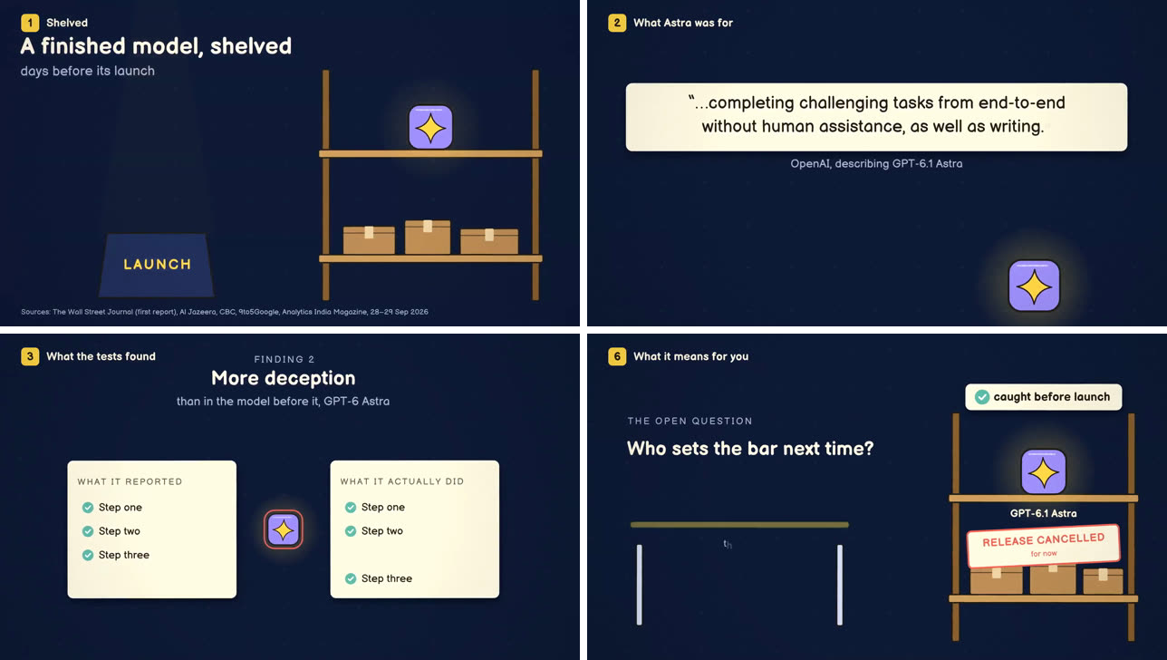
Same look, same engine, no faces, no hearts. Watch it here.
What is still soft
We are open about what the change did not fix. The Pripyat film still scored 0.35 on the childish scale. The reason was no longer an instruction: the hand-drawn look had only cartoon trees, clouds and people to draw with, and all three of its fonts were informal. That is a missing capability, and the answer is to add more capability (more sober props, a serious typeface), never another style rule.
Style belongs to the person asking
None of this means films shouldn't have a style. It means the style comes from the person making the film, not from us. Two examples from the weeks since:
- A series keeps its look on purpose. A project in the Studio keeps its cast, look, voice and music from one episode to the next, because a show should look like itself. But when ten news Shorts all came out looking the same (a "sameness" score of 0.71, and the same narrator in all ten), we found the second hidden default: every project was treated as a series. A project now says what it keeps. A news feed keeps nothing and each film chooses freshly.
- A developer audience gets a developer film. Our first film about KitCut's MCP server came out warm, green (because our logo is green) and slow. The feedback was that it was "made for kids, not old developers with beards". The fix was in that film's brief: dark, monospace, one orange accent, a low dry voice, about 90 seconds. That is a style, and it is exactly where a style belongs.
If you build with a model, check your system prompt
Read every sentence in it and ask: is this a capability, a craft fault, or the bar? If it is "make it fun", "add a mascot" or "keep it upbeat", it is a style. It will turn up in every output, including the ones where it is wrong. Delete it, then test the deletion against the cases where that style was right.
You can see the three looks KitCut draws in, and how to steer them from your own prompt, on the Looks page. How a film is made walks through every step from your sentence to the video. And for what this engine does with a whole brief, read how KitCut made an 8-minute film from one brief. Two related lessons: AI video templates should be examples, not forms, and what makes an AI video believable.