 KitCut
's news desk: sourced news explainers, 32 in four days
- Format
- A news bulletin, one story each
- Films
- 32 in four days
- Most watched
- 15,860 views
- From YouTube search
- 95% of those views
- Look
- Collage, a paper news desk
News is the hardest thing to explain with AI video. A model that makes up a plausible chart or a plausible headline is fine for a dream sequence and useless for news. So we ran a news desk on our own YouTube channel, @kitcut-hq, to see what KitCut could do with it. Between 8 and 12 October 2026 it made 32 films on AI, tech and the economy. One of them, on drone strikes on Yandex's data centres, has 15,860 views, and 95% of them came from people searching YouTube.
"Yandex data centers hit three times in four days, and its bot traffic went quiet", 2:59. 123 likes and 66 comments on YouTube, and viewers watch half of it on average.
A format written once
The bulletin's rules sit in the project's brief, so a new story needs only its facts. The ones that matter most:
- The first frame is the news. A strap says BREAKING (only for news under two days old), the headline is eight words or fewer, and the source's own page is already on screen under it. The first spoken sentence says who did what in fourteen words or fewer.
- Then "here's what we know". Three to five facts, one at a time, each with its proof on screen as it is said: the source's own page, a number set large, or a short quote with who said it.
- Then what is not known. Every bulletin says plainly what nobody has shown yet, before the one line on why it matters.
- Facts only from the fact sheet. Each story starts as a fact sheet with its sources, a "commonly misreported" section and anything unconfirmed marked. The film uses its exact numbers and keeps each source's own caution ("says", "believes"). Unconfirmed claims are left out.
- No music at all, a reporter's voice, and a lower third naming the outlet and the date of whatever is on screen.
What's on screen is the real thing
The Yandex bulletin shows the three sites on a real map, the satellite photo of one of them after the strike, Yandex's own post on X, the Cloudflare Radar chart of its bot traffic falling to the floor, and the reaction on X. Each has its source in the corner.
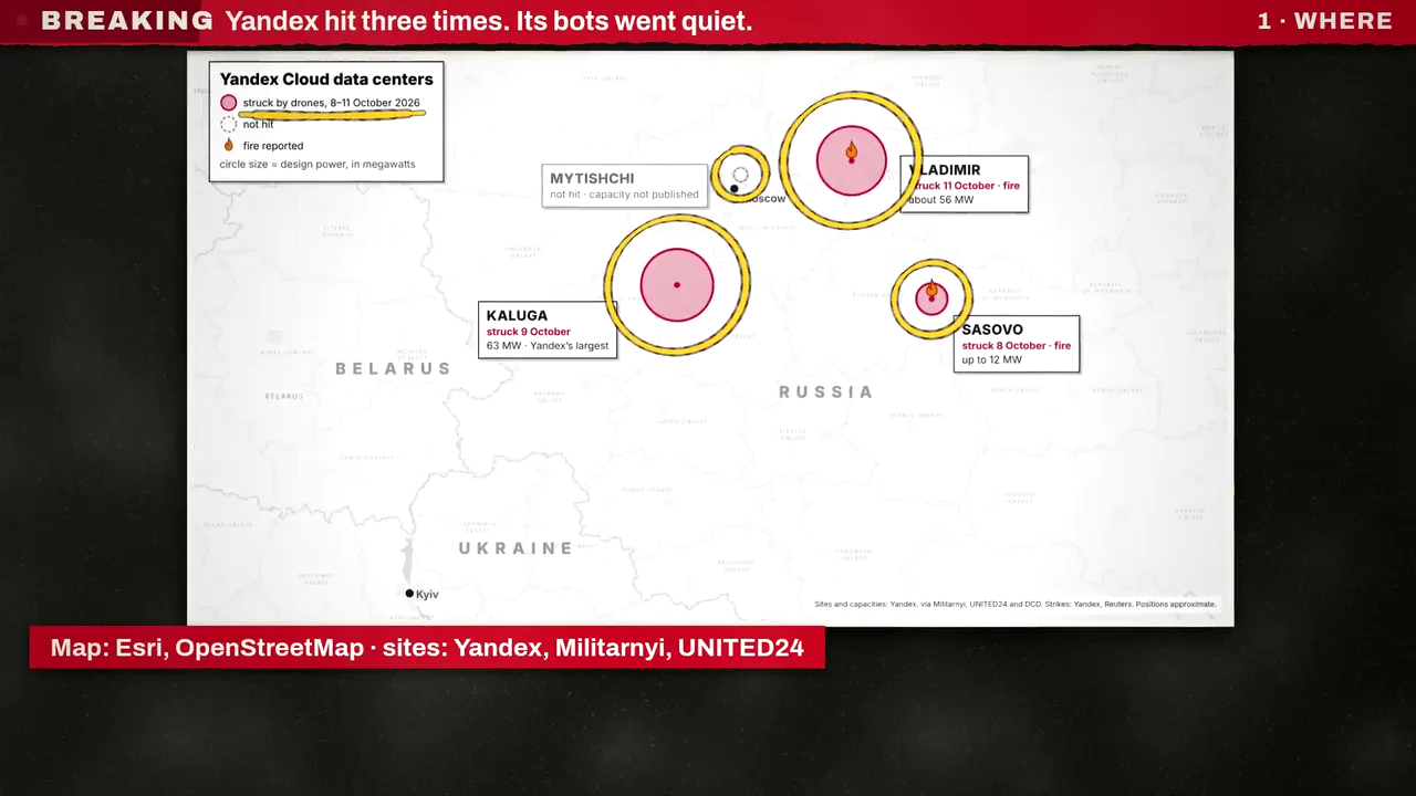
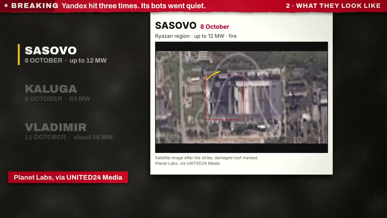
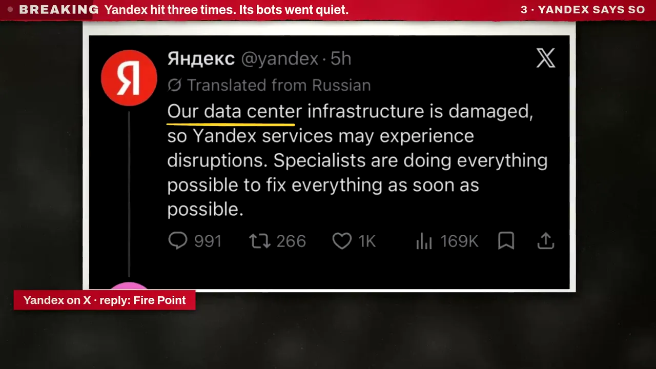
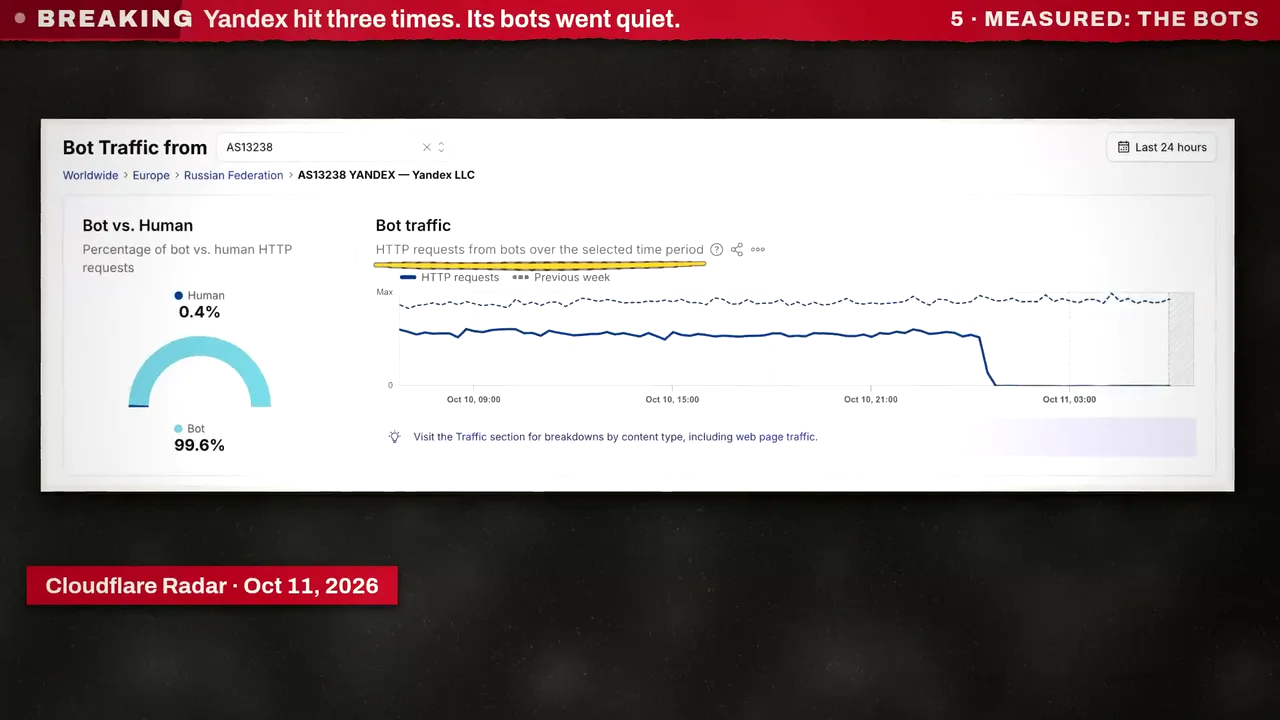
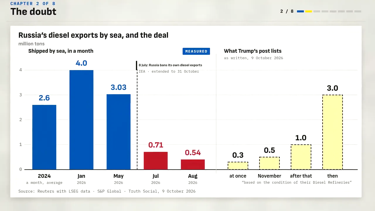
The same desk makes longer research films when a story needs them. The 8-minute film on Trump's Russian diesel deal draws its charts from the numbers in its fact sheet, marks each one measured or estimated, and names its sources under it.
Shorts, from the same desk
Most bulletins are Shorts, tall and under three minutes. The same rules hold in a phone's frame: the source's own page in the first second, the numbers set large, every word of the narration drawn as it is said.
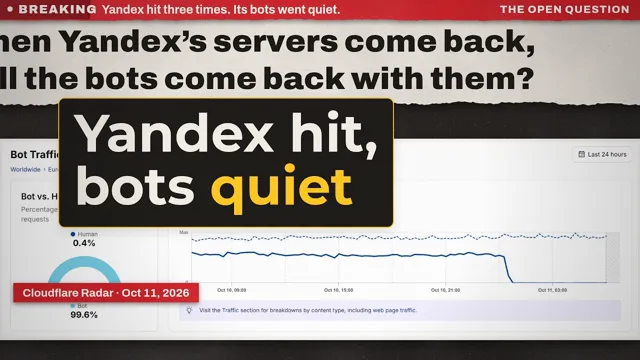 Yandex data centers hit three times in four days, and its bot traffic went quiet2:59 · 15,860 views
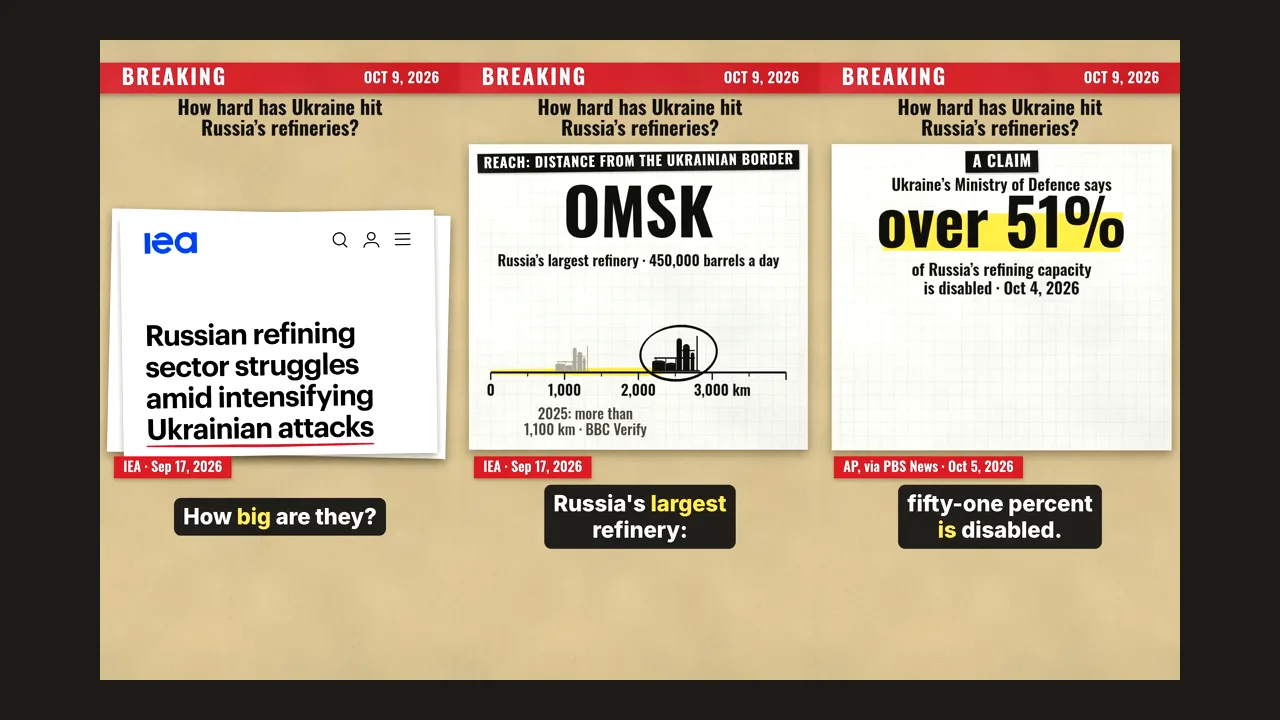
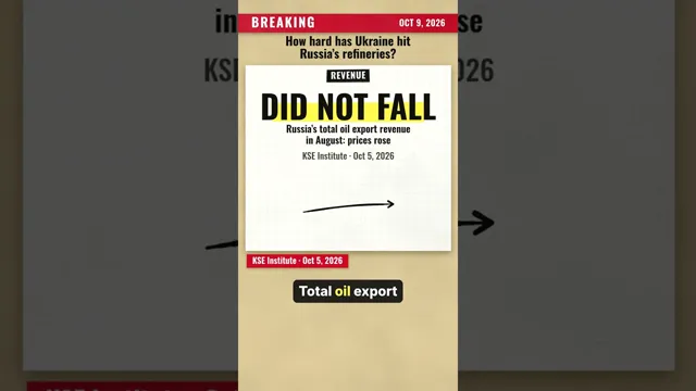 Trump's diesel deal meets Russia's own export ban: what Ukraine's refinery strikes didShort · 1:46 · 1,588 views
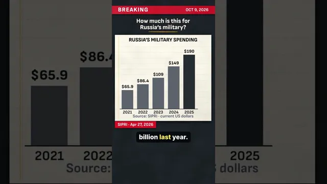 Trump clears Russian diesel worth about $7 billion: what that sum equalsShort · 1:41 · 1,471 views
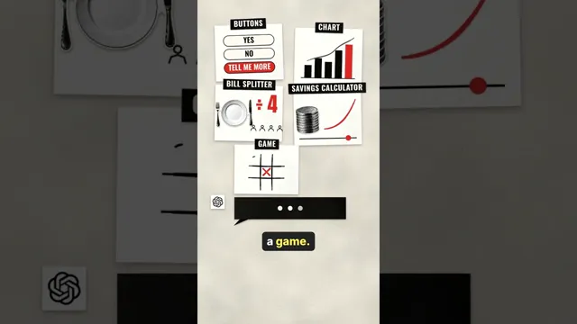 GPT-6 is now in everyone's ChatGPT. It can answer with a working calculator.Short · 0:41 · 1,044 views
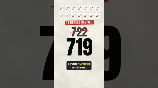 OpenAI published 722 AI-written math papers. Then it withdrew three.Short · 0:41 · 841 views
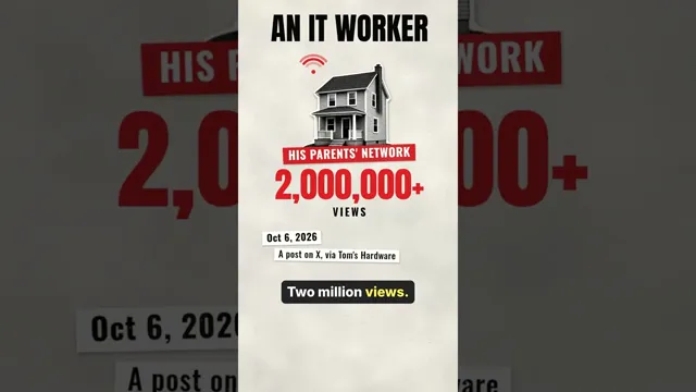 A coffee machine sent a terabyte of data in ten days. Nobody knows what was in it.Short · 0:41 · 700 views
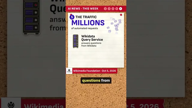 OpenAI agents caught editing Wikipedia's sites, its host says2:00 · 430 views
 Move the slider. ChatGPT is never asked. What's really inside its new answers.2:20 · 298 views
The numbers
In the 28 days to 21 October, the KitCut channel had 24,194 views, against 3,621 in the 28 days before. 16,713 of them came from YouTube search. The Yandex bulletin went up on 12 October; by 21 October it had 15,860 views, 123 likes and 66 comments.
What made it work
- The story first, the proof right behind it. Search brings people who want to know what happened. The first frame tells them, and every claim after it shows where it comes from.
- The format never changes. With the rules in the brief, a bulletin is a fact sheet and a headline. Four days, 32 films.
- Saying what isn't known. The Yandex film ends on what the data does not show. It is the most honest part of the film.